22/12/2011
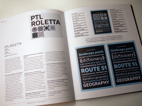
Anthony Cahalan has done an interview with me about PTL Roletta for Desktop Magazine from Australia.
Read the interview here:
What inspired the design of your typeface?
PTL Roletta was originally conceived as a corporate typeface during a 2003 pitch for the »Rundfunk Berlin Brandenburg« (Berlin-Brandenburg Broadcasting). The main idea behind the typeface was a synthesis of contrasts, combining rectangular with round elements as well as slightly condensed capitals with slightly wide lowercase letters. The pitch was not successful, but I continued to develop the typeface and decided in 2006 to apply only round terminals to create a family of five weights with many advanced typographic features: small caps, non-lining, lining and tabular figures, alternate characters, arrows, ligatures, symbols, ornaments and mathematical signs.
What was the first character you designed and why?
I began by sketching key lowercase characters, such as the »n« and »o« as well as the »h« and »b« to test my initial design idea, to explore various details and to set parameters like weight, x-height, ascenders, descenders and metrix. I continued with the letters needed to set the word »hamburg«, then added letters, printed out single words in various point sizes, correcting details, set paragraphs, and adjusted spacing.
Is it important for a typeface to have a few distinctive characters to make it more memorable?
That’s the biggest challenge in type design: to be distinctive without being too idiosyncratic. If you’re not distinctive enough your typeface will look like many other typefaces, if you’re too idiosyncratic, typographers will soon tire of looking at your typeface. Roletta’s lettershapes are functional and, to a certain extent, conventional. When used at large sizes, however, Roletta reveals the strong personality of its details, especially the rounded terminals.
What design challenges did you confront and how did you resolve them?
One of the biggest challenges was the shift of software: I started Roletta in 2003 using Fontographer which has limited magnification, but when I switched to Fontlab and appreciated its ability to zoom very close to the vector points , I recognized that many control vectors of the tangent points especially in the italic versions had little »bumps«. I worked on Roletta over the course of seven years from the initial sketches and its first release as a custom font family to its final release by the font label primetype in 2010.
What do you see as the typeface’s ideal uses?
In 2007, Eye magazine uesed Roletta as the main typeface for the »typography special edition«, including a feature article about me and my work. I suppose for any typedesigner that is an ideal use, to have an article about one’s own work set in your own typeface. In contrast to a static finished piece of work typefaces are highly dynamic and, when used by others, they assume a life of their own.
Where did the name of the typeface come from and what is its significance?
Because I was designing a round typeface, I started to play with the words »round« and »rolling« and »letter« and after a while »Roletta« was born.