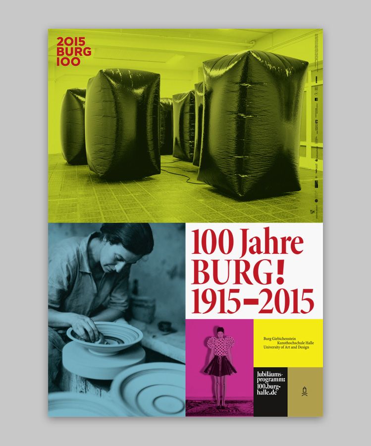
project: Logotype for the 100th anniversary of
Burg Giebichenstein
client: Burg Giebichenstein University of Art and Design
typeface: Based on
Burg Letters
anniversary website:
100.burg-halle.de
project management: Nike Bätzner and Jule Reuter
public relations: Anne Fleckstein, Brigitte Beiling, Franziska Heller
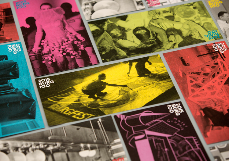
credits: All printed materials for the 100th Anniversay are desigend by
Katharina Köhler,
Wolfgang Schwärzler and
Wolfgang Hückel (under my supervision).
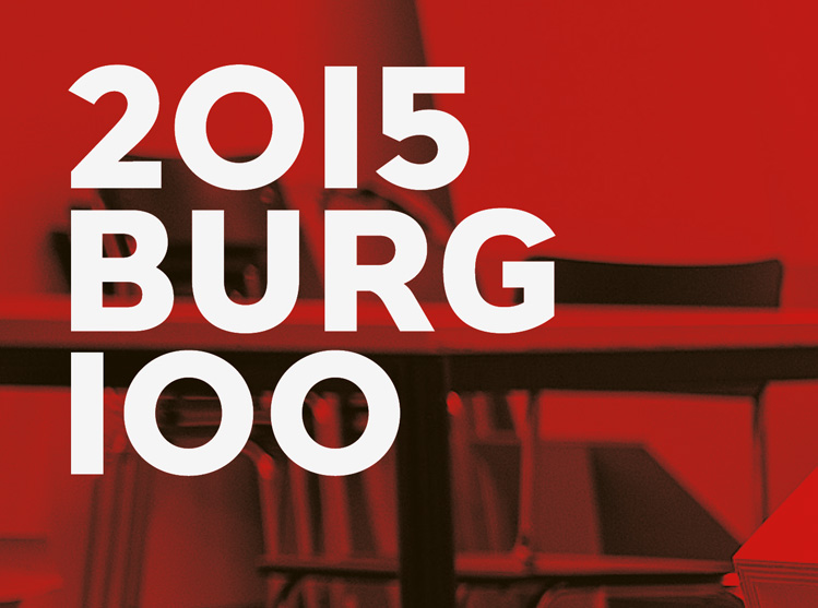
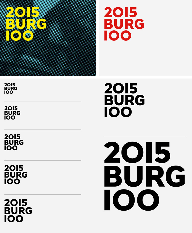
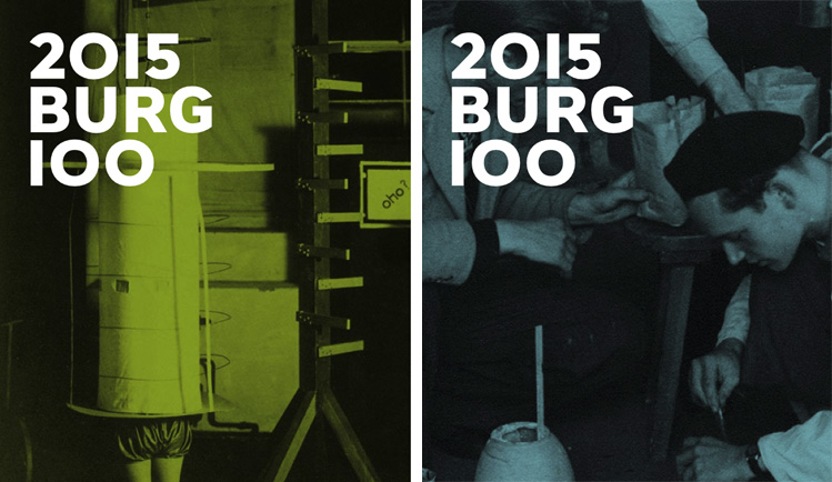
For the upcoming anniversary of Burg Giebichenstein University of Art and Design in 2015 I designed the accompanying logotype.
2015 BURG 100 is based on the so called “BURG Letters”, the dynamic logotype for BURG, the colloquial short form for Burg Giebichenstein University of Art and Design (more about the visual identity of the school
here.
Characteristics of the logotype are the distinctive round shapes of the figure 0 combined with the solid bar für the figure 1 all sharing the same thickness of stroke as the Burg letters.
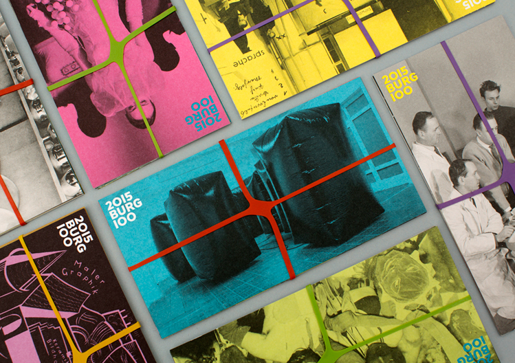
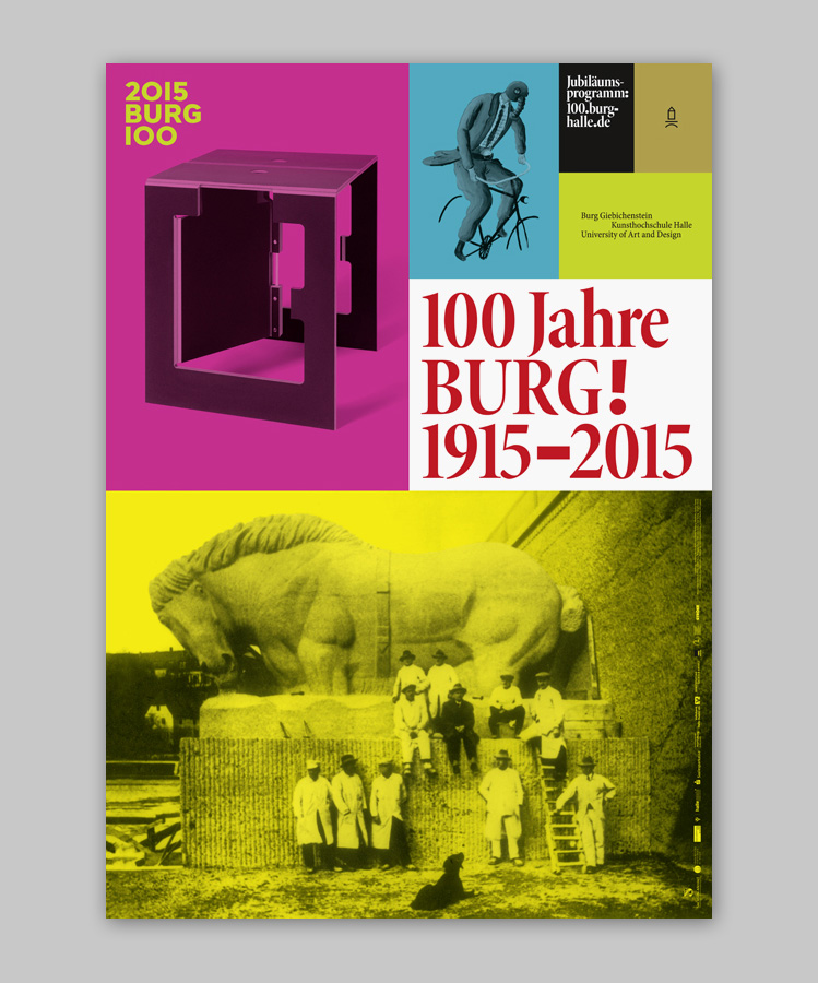
The logotype has been in use since the beginning of 2014 and is used for all communication and collateral for the 100th anniversary.
